Find out in only 2 min
Take the free quiz to reveal the perfect Showit website template for your business!
Which Showit Website Is Right For You?

Get early access to the sale
Black Friday is coming.


These days, having a lead magnet on your website is isn’t just a good idea – it’s an absolute necessity. A lead magnet is a great way for people to get a taste of your expertise with a sampling of information. Being strategic about where you place your lead magnet throughout your website can make a big difference in getting people to sign up.
Let’s take a look at the 6 best areas on your website to place a lead magnet and turn those warm leads into paying clients!
What is a Lead Magnet?
First, let’s talk about what exactly is a lead magnet. Simply put, a lead magnet is free sampling of your knowledge, expertise and/or service.
It can be in the format of a PDF, spreadsheet, email series, video, Canva template, any format you choose! In order for someone to get the free item, they need to provide you with their email address.
What is the Purpose of a Lead Magnet?
While we all love free content, the true purpose of a lead magnet is to show that you’re an expert in your field while giving the reader a teaser of what it’s like to work with you. Offering free advice or a free tool to help a reader will make them remember you and come back to you when they are ready for your services.
How to Make a Lead Magnet?
Pinterest has tons of ideas for lead magnets, but the best way to figure out what kind of lead magnet to create is to:
- Ask you audience what they need help with the most
- Follow and observe your competition, read their post comments and see what questions people are asking
- Put yourself in your client’s shoes, what questions do they typically ask you? What do they struggle with the most? What would help make their lives easier?
After you’ve decided on a topic for your lead magnet, decide on the format you want. For example, if you’re a photographer and you want to give away stock photos, your lead magnet can be a link to a folder on Google Drive with 10 stock photos.
If you’re a book keeper, your lead magnet could be access to a spreadsheet you’ve formulated. Here are all of the various types of lead magnet formats you should consider using:
- Email series
- PDF download
- Spreadsheet
- Google drive folder access
- Canva template
- Video
Where to place Lead Magnets throughout your website
Once you’ve created your lead magnet, it’s time to add it to your website. If you think just adding a section to your homepage will be enough to get people to sign up, you’re missing out on tons of other opportunities!
I’m going to walk you through all of the best places on your website to display your lead magnet. All websites are different, so some options may work better for you than others. You can try some of these placements, or all of them!
1. Sitewide Notification Banner
A sitewide notification banner is that thin strip at the very top of every page of your website. Typically it’s one line of text with a link to an offer. This is a GREAT place to show your lead magnet since it’s on every page of your website and it doesn’t take up much space.

2. Homepage
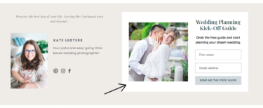
An obvious choice for displaying your lead magnet offer is on your homepage, but being strategic about exactly where on your homepage is critical. I advise putting your offer as high up on the page (typically below your main introduction) so that it’s seen almost immediately. In the section on your homepage, you’ll have a little more room compared to the sitewide notice to show a visual of your lead magnet and some catchy text to draw in your reader.

3. Footer
Your website footer may be simplistic and basic, or it may have a potpourri of information. Either way, I highly recommend adding your lead magnet to your footer for two reasons:
- It’s displayed on every page
- Your reader may have missed your sitewide notification or they weren’t convinced yet that they should sign up. The footer is a great place to ensure that your lead magnet offer is seen.
4. Pop-Up
People are wondering ‘Are popups still a thing?’ Yes! Popups are still a great way to show your reader a special offer that may disappear forever if they don’t sign up now. You’ll need to have an email marketing platform (I highly recommend Convertkit) to create your lead magnet pop-up. It’s up to you if you want the pop up on every page, or specific pages.

5. Blog Post
If your website has a blog and you are writing consistently and getting blog traffic, adding a lead magnet offer to your blog posts can be a gold mine! In fact, you should add more than one to each blog post. I suggest adding an inline signup (within the body of the post or at the end of the post) as well as a strategically timed popup or an exit intent popup.

6. Sidebar
Similar to your website footer and sitewide notification bar, your blog sidebar is a great place to add your lead magnet offer since it will be on every page.
Examples of Lead Magnets
A lead magnet can look like anything you want, but do not forget to include these two important details in your lead magnet:
- Your business name/logo and website URL
- A page or a link to a page about you, your services and how you can provide further help
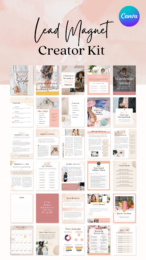
Here are examples of successful lead magnets I’ve designed for my own clients, plus my Canva template kit where you can build your own lead magnets! Download it to your Canva account right here >>

Did you like this post? Ask me a question in the comments and I’ll reply back!


$157 - PAYMENTS AS LOW AS $36.75/MO
Showit Website Template for Health Coach

$157 - PAYMENTS AS LOW AS $36.75/MO
Showit Website Template for Coaches

$157 - PAYMENTS AS LOW AS $36.75/MO
Showit Website Template for Virtual Assistant

$157 - Payments as low as $36.75/MO
Showit Website Template for Coaches


Boost Your Business with Fun Quizzes!
Free Quizzes

Next Story
Previous Story


TAKE THE QUIZ
Discover your brand's unique personality + reveal a special offer!


Thanks for sharing this. Is is ok to have all 6? I’m worried about being too pushy
I think it depends on your website but I don’t think using all 6 places are being too pushy at all – for one main reason: you want to assume your viewer hasn’t seen the lead magnet offer and you’re making sure it’s seen. One approach is to change the wording for each placement so it looks slightly different. I hope this helps!